Exploratory Analysis of the Tips Dataset
A walkthrough of my first end-to-end notebook — loading data, checking quality, visualising patterns, and comparing groups.
- pandas
- seaborn
- eda
- python
This post summarises my first proper notebook. I used the Tips dataset — 244 restaurant bills with tip amounts and details like gender, smoking section, and day of the week.
1. Load the data
import pandas as pd
import seaborn as sns
import matplotlib.pyplot as plt

df = pd.read_csv(
    "https://raw.githubusercontent.com/mwaskom/seaborn-data/master/tips.csv"
)| Line | Meaning |
|---|---|
import pandas as pd | Brings in pandas and gives it the short name pd |
import seaborn as sns | Chart library for statistical plots |
import matplotlib.pyplot as plt | Controls figure size and titles |
pd.read_csv(...) | Downloads and reads the CSV into a DataFrame (a table) |
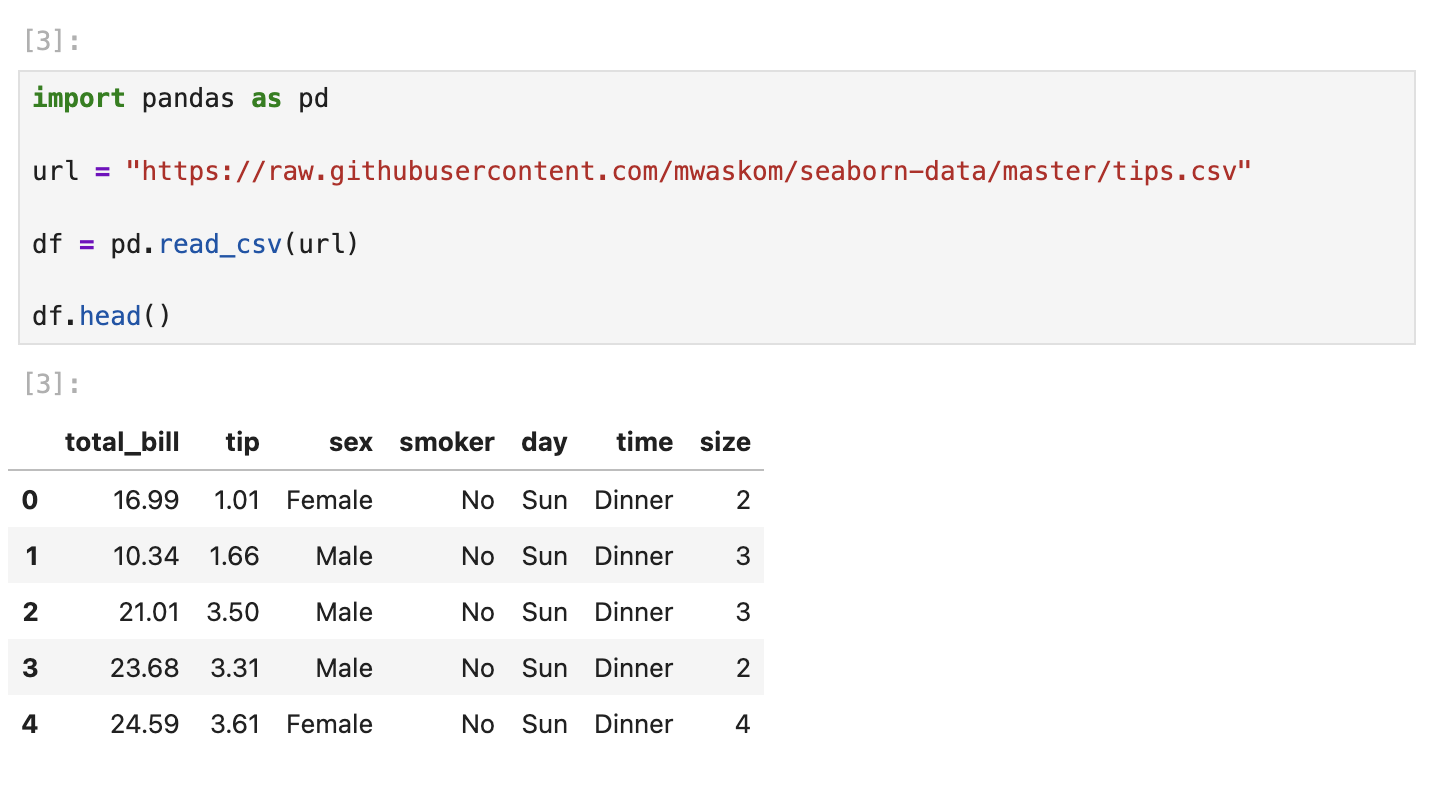
2. First look at the table
df.head()
df.columns
head() shows the first 5 rows. You see columns like total_bill, tip, sex, smoker, day, time, and size. columns lists every column name in the table.
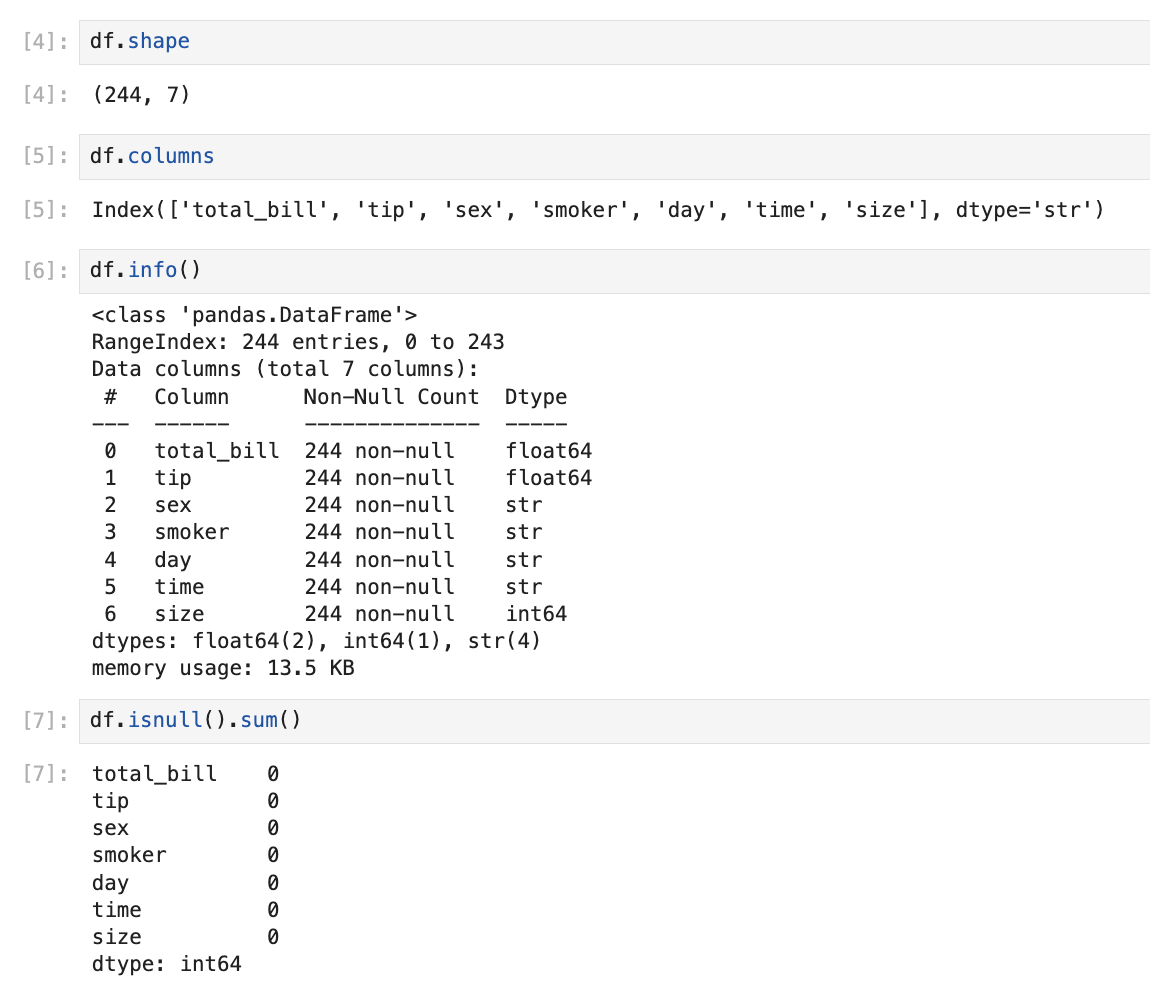
df.shapeshape returns (rows, columns) — here 244 rows, 7 columns.
df.info()
df.isnull().sum()| Method | Meaning |
|---|---|
info() | Row count, column names, and data types |
isnull().sum() | Counts missing values per column — all zeros here |
3. Summary statistics
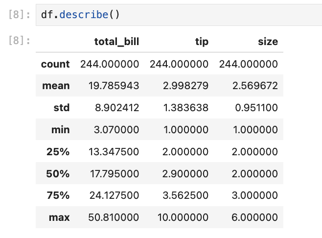
df.describe()describe() gives quick stats for numeric columns — mean, min, max, and quartiles. Useful before plotting: average bill is around $19.78, average tip around $2.99.
4. Visual exploration
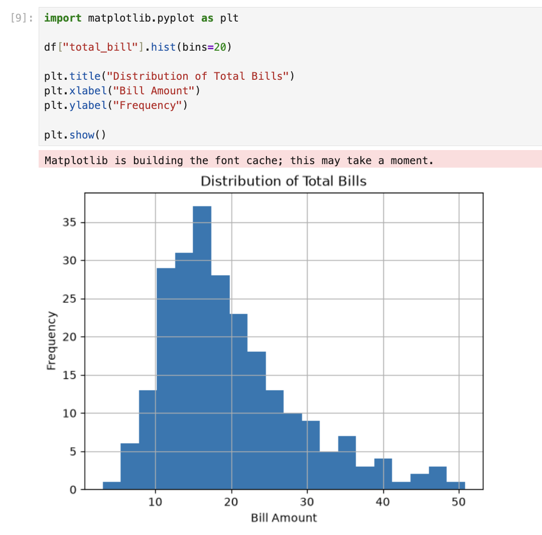
Distribution of bills
import matplotlib.pyplot as plt

df["total_bill"].hist(bins=20)

plt.title("Distribution of Total Bills")
plt.xlabel("Bill Amount")
plt.ylabel("Frequency")

plt.show()
A histogram groups values into bins and counts how many fall in each. kde=True adds a smooth curve over the bars. Most bills sit between $10–$25.
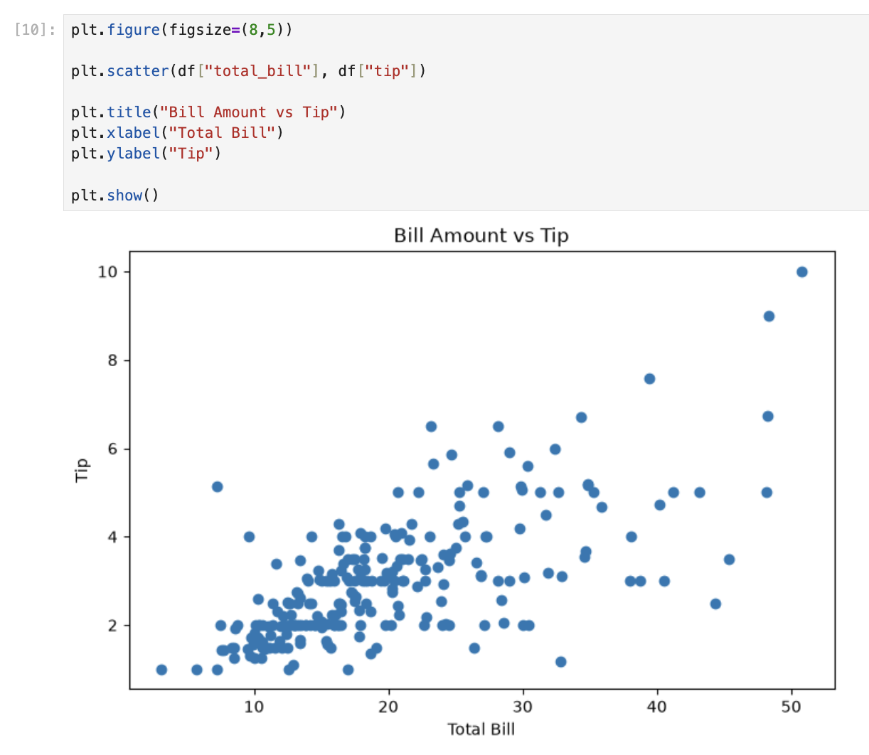
Bill vs tip
plt.figure(figsize=(8,5))

plt.scatter(df["total_bill"], df["tip"])

plt.title("Bill Amount vs Tip")
plt.xlabel("Total Bill")
plt.ylabel("Tip")

plt.show()
A scatter plot puts one dot per row. Higher bills tend to have higher tips — a positive relationship.
5. Filtering rows
df[df["total_bill"] > 40]This keeps only rows where the bill was over $40 — a quick way to find high-spending tables.
6. Grouping and aggregation
df.groupby("sex")["tip"].mean()groupby("sex") splits the table by gender. ["tip"].mean() calculates the average tip per group.
df.groupby("day")["total_bill"].sum()Same idea — total revenue per day of the week.
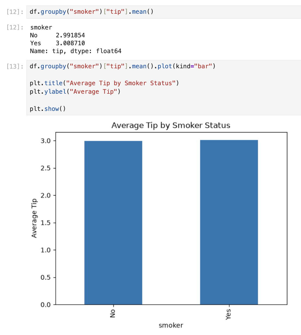
df.groupby("smoker")["tip"].mean()Compares average tips: non-smokers $2.99, smokers $3.00 — nearly the same.
What I took away
| Skill | What it taught me |
|---|---|
head, info, describe | Understand data before analysing |
isnull().sum() | Always check for missing values |
histplot / scatterplot / barplot | See patterns numbers alone hide |
df[condition] | Filter to interesting rows |
groupby().mean() | Compare groups in one line |
This notebook is small, but it covers the core loop of data analysis: load → inspect → visualise → summarise. Everything after this builds on the same pattern.