Adelaide Housing Pulse, Part 1: Wrangling 11 Years of SA Government Housing Data
Starting a real flagship project on Adelaide house prices: sourcing 46 quarterly files from South Australia's open data API, fixing several genuine data bugs, and finding which suburbs actually grew fastest since 2015, explained so both engineers and non-technical readers can follow it.
- pandas
- data-cleaning
- python
- adelaide-housing-pulse
This is the first post in a new series called Adelaide Housing Pulse. The goal, in one sentence: figure out which Adelaide suburbs actually got more expensive to live in over the last 11 years, and prove it with real government numbers instead of a gut feeling.
No pre-cleaned Kaggle file this time. The data comes straight from data.sa.gov.au, the South Australian Government’s own open data site: 46 separate quarterly reports covering Q1 2015 through Q2 2026. Real government data means real mess, and most of this post is about the mess: what went wrong, why it mattered, and how each problem got fixed before a single number could be trusted.
1. Collecting 46 reports without clicking 46 times
The dataset’s web page lists 46 download links, one per quarter, meant to be clicked by hand. Instead, we sent a small program to do it: it asks the government’s website “give me your full list of files,” then downloads every single one automatically. Think of it as sending a robot to a filing cabinet instead of walking there yourself 46 times. It also means the whole process can be re-run later when the government publishes another quarter, without doing any of this by hand again.
import re
from pathlib import Path
import requests

PACKAGE_ID = "0d447195-1158-4a3c-8cc7-0e333b87eb72"
API_URL = f"https://data.sa.gov.au/data/api/3/action/package_show?id={PACKAGE_ID}"

resp = requests.get(API_URL, timeout=30)
resources = resp.json()["result"]["resources"]
len(resources)462. The first file wouldn’t even open
sample = DATA_DIR / "2025_Q2.xlsx"
xls = pd.ExcelFile(sample)
ModuleNotFoundError: No module named 'openpyxl'This is the code equivalent of trying to open a locked door without the key. Python can read plain text easily, but Excel files are a more complex format, so it needs a separate add-on tool called openpyxl to open them at all. One install later, the door opened fine, and the actual column headers came through:
df = pd.read_excel(sample, sheet_name="Sheet1")
df.columns.tolist()
['City', 'Suburb', 'Sales 2Q 2024', 'Median 2Q 2024',
'Sales 2Q 2025', 'Median 2Q 2025', 'Median Change']Worth pausing on what this actually shows: every quarterly report isn’t just “this quarter’s prices.” It’s a comparison: this quarter this year, next to the same quarter last year, plus a percentage change. Useful to know before combining 46 of these into one table, or the same quarter would get counted twice.
3. The same information, written two different ways
An older file, from 2015, told a slightly different story:
old_df = pd.read_excel(DATA_DIR / "2015_Q1.xlsx", sheet_name="Sheet1")
old_df.columns.tolist()
['City', 'Suburb', 'Sales\n1Q 2014', 'Median\n1Q 2014',
'Sales\n1Q 2015', 'Median\n1Q 2015', 'Median\nChange', 'Unnamed: 7']Same idea as before, but someone had typed each column title across two lines instead of one, like a sticky note folded in half. To a human that’s obviously the same label. To a computer, “Sales” on one line and “1Q 2015” on the next line is a totally different piece of text than “Sales 1Q 2015” on one line, so nothing would match up correctly later without fixing it. There was also an empty, nameless column, like an extra chair at the table nobody sat in. Both got cleaned up with one small helper applied to every file:
def normalize_columns(columns):
    return [re.sub(r"\s+", " ", str(c).replace("\n", " ")).strip() for c in columns]

def drop_unnamed(df):
    return df.loc[:, ~df.columns.str.match(r"^Unnamed")]
4. Numbers that weren’t really numbers, and a file in disguise
A handful of reports from 2019 and 2020 were CSV files instead of Excel files, and they hid two separate problems.
The first: prices had commas in them, written like "1,600,000". To a computer, a comma inside a number turns the whole thing into plain text, not something it can add, compare, or average. It’s the difference between the word “sixteen hundred thousand” and the actual number 1,600,000. A small fix stripped the commas back out so the values became real numbers again:
def clean_numeric(series):
    return pd.to_numeric(series.astype(str).str.replace(",", "", regex=False), errors="coerce")
The second was stranger: three files, all named like CSVs, refused to open under any text setting tried. That’s a strong sign they weren’t actually text files at all. Peeking at the very first few bytes inside confirmed it: they started with the letters PK, which is the secret signature every Excel file (and, in fact, every zipped file) carries. The government’s own catalog had mislabeled three real Excel files as CSVs, like a letter with the wrong label stuck on the envelope. Once that was known, the files opened correctly by checking what they actually were, not what their name claimed:
def sniff_is_excel(path):
    with open(path, "rb") as fh:
        return fh.read(4).startswith(b"PK")
5. One neighborhood, 900 different names
With every file finally readable, everything got combined into a single function that reads one report, cleans it up, and keeps only that report’s own current-quarter numbers (the “last year” comparison columns get skipped here, since that same data shows up properly in that earlier year’s own file):
def load_quarter_file(path):
    year, quarter = parse_year_quarter(path)
    if path.suffix.lower() == ".csv" and not sniff_is_excel(path):
        raw = read_any_csv(path)
    else:
        raw = pd.read_excel(path, sheet_name=0)

    raw.columns = normalize_columns(raw.columns)
    raw = drop_unnamed(raw)
    tidy = extract_current_quarter(raw, year=year, quarter=quarter)
    tidy["Sales"] = clean_numeric(tidy["Sales"])
    tidy["Median"] = clean_numeric(tidy["Median"])
    return tidy
Running that across all 46 files and stacking the results into one table turned up something odd:
housing = pd.concat(frames, ignore_index=True)
housing.groupby("Suburb")["Sales"].sum().describe()["count"]954.0Metro Adelaide has around 400 real suburbs, not 954. What actually happened: across 11 years of separately-typed reports, the same suburb sometimes got written as “Bradbury,” sometimes “BRADBURY,” sometimes with an invisible extra space at the end. A person reads all three as the same place instantly. A computer reads them as three different words, the same way “Sara” and “sara ” would be treated as two different names in a phone contact list. Standardizing every suburb name to the same capitalization and trimming stray spaces brought the count down to something believable:
housing["Suburb"].str.strip().str.upper().nunique()493Fix applied at the source, then everything rebuilt: 22,122 rows, 493 real suburbs, 0 read errors.
6. Giving the data a real sense of time
Up to this point, “year” and “quarter” lived as two separate plain numbers, which makes asking “how did this change over time” clunky. Pandas has a purpose-built type for exactly this, called a Period, plus a way to organize the whole table like a filing cabinet: one drawer per suburb, folders inside sorted by quarter, so any suburb’s full history can be pulled out instantly by name instead of searching the whole table each time.
housing["Period"] = pd.PeriodIndex.from_fields(year=housing["Year"], quarter=housing["Quarter"], freq="Q")
housing = housing.set_index(["Suburb", "Period"]).sort_index()
7. A number that looked exciting, and was wrong
Now the actual question: which suburb grew the fastest since 2015? First attempt: compare each suburb’s earliest known price to its most recent known price.
growth = housing.groupby(level="Suburb")["Median"].agg(["first", "last"])
growth["pct_growth"] = (growth["last"] - growth["first"]) / growth["first"] * 100
growth.sort_values("pct_growth", ascending=False).head(3)
first last pct_growth
Suburb
BRADBURY 412000.0 2392600.0 480.73
GLENELG SOUTH ...480% sounded too good to be true, and it was. Checking Bradbury’s actual sales record showed why: every single quarter that had any data at all showed exactly one house sold, never more. A “typical price” based on one house isn’t measuring a neighborhood, it’s just that one house’s price. So this “480% growth” wasn’t the suburb getting more expensive. It was the price of one random house in 2020 compared to the price of a completely different random house in 2026, five years later, with nothing connecting them except sharing a suburb name. That’s like judging how much taller a class of kids got by measuring one kid once, then a different kid five years later, and calling the difference “growth.”
8. A number worth actually trusting
Two changes fixed this. First: only rank suburbs that had real, steady sales happening, not just the occasional lucky or unlucky single sale. Second: instead of comparing one quarter to one quarter, compare a full year’s average price at the start to a full year’s average price at the end, which smooths out any single unusual sale.
def robust_growth(median_series, window=4):
    early = median_series.dropna().head(window).mean()
    late = median_series.dropna().tail(window).mean()
    return (late - early) / early * 100

reliable_suburbs = suburb_totals[suburb_totals >= suburb_totals.median()].index
robust = housing.loc[reliable_suburbs].groupby(level="Suburb")["Median"].apply(robust_growth)
robust.sort_values(ascending=False).head(6)
Suburb
DAVOREN PARK 257.3
ELIZABETH DOWNS 251.4
ELIZABETH NORTH 249.1
ELIZABETH PARK 225.8
ELIZABETH SOUTH 219.5
ELIZABETH EAST 216.0This time the top of the list makes real sense: six neighboring suburbs in Adelaide’s north (Davoren Park and five different Elizabeth-area suburbs) all show up together, all growing by roughly 200 to 260 percent since 2015. That’s not one lucky house sale distorting things. It’s six connected neighborhoods moving together, backed by genuine, sustained buying and selling in every one of them, which is exactly what a real regional trend looks like.
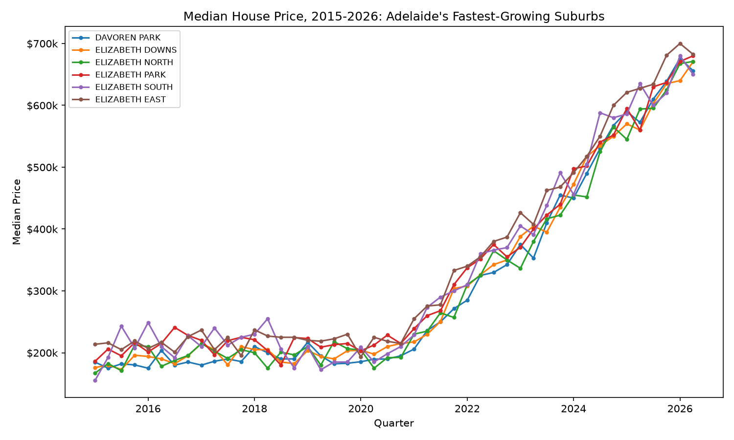
Here’s what that actually means in real terms: houses in this part of Adelaide that typically cost somewhere between $180,000 and $250,000 back in 2015 are now typically selling for $650,000 to $700,000, more than double, in some cases close to triple. The chart shows it clearly: five years of flat, bouncy prices through about 2020, then a steep, near-simultaneous climb across all six suburbs together from 2021 onward.
What actually went wrong, and the fix
| Problem | What it looked like | How it got fixed |
|---|---|---|
| Missing Excel tool | ModuleNotFoundError: openpyxl | Installed the missing tool. Pandas needs it separately to read .xlsx files |
| Column titles written differently across years | 'Sales\n1Q 2015' vs 'Sales 1Q 2015' | Flattened every title to the same format before comparing them |
| Prices stored as text, not numbers | "1,600,000" couldn’t be added or averaged | Stripped the commas out, converted back to real numbers |
| A file lying about its own type | A “CSV” file that wouldn’t open as text | Checked the file’s actual first few bytes instead of trusting its name |
| Same suburb, spelled differently each year | 954 “suburbs” where only ~400 real ones exist | Standardized capitalization and removed stray spaces |
| Judging growth from one lucky or unlucky sale | A suburb with 1 sale a quarter showing 480% “growth” | Only trusted suburbs with steady sales, compared full-year averages instead of single quarters |
Takeaway
Every one of these six problems was ordinary: a missing tool, inconsistent spelling, numbers hiding as text, a mislabeled file, and a shortcut statistic that got fooled by too little data. None of it was exotic, and that’s the point: this is what real data actually looks like before anyone’s cleaned it, and skipping any one of these checks would have led to a confident, wrong headline. The upside of doing it properly is a finding that actually holds up: Adelaide’s Elizabeth-area suburbs have been the city’s real growth story since 2015, not because a number said so, but because the number survived being questioned.
Next in this series: loading this dataset into SQL and layering in official population and income data to start answering why this part of Adelaide grew the way it did.